A good tool should feel like a quiet ally, not a loud boss.
There’s a moment many people recognize: you open an app to do one small thing, and forty minutes later you’re still there—toggling settings, dismissing pop-ups, deciphering what it wants from you. Somewhere along the way, the tool stopped being a tool. It became a place you must manage, a system you must appease, a little bureaucracy living in your pocket.
Designing tools that serve people—rather than training people to serve tools—sounds like an obvious goal. Yet modern software and devices often drift toward the opposite. Features accumulate like barnacles, metrics take precedence over meaning, and “engagement” becomes a euphemism for capturing attention. The result isn’t just minor annoyance. It’s a quiet reshaping of daily life: how we plan, how we communicate, how we work, and even how we think of ourselves.
A human-serving tool doesn’t merely function. It respects time, reduces friction, and makes the user feel capable. It has humility.
When the tool becomes the task
Some tools insert themselves into the center of the work. Instead of writing, you’re formatting. Instead of cooking, you’re watching a screen. Instead of listening to a friend, you’re monitoring whether the call is still connected, whether the audio is routed properly, whether the app updated overnight and moved the buttons.
This is not always malicious. Often it happens because teams build for edge cases, for growth, for future-proofing, for internal reporting, for the next investor deck. Each decision makes sense in isolation. But in combination they create a subtle inversion: the user’s goal becomes secondary to the tool’s requirements.
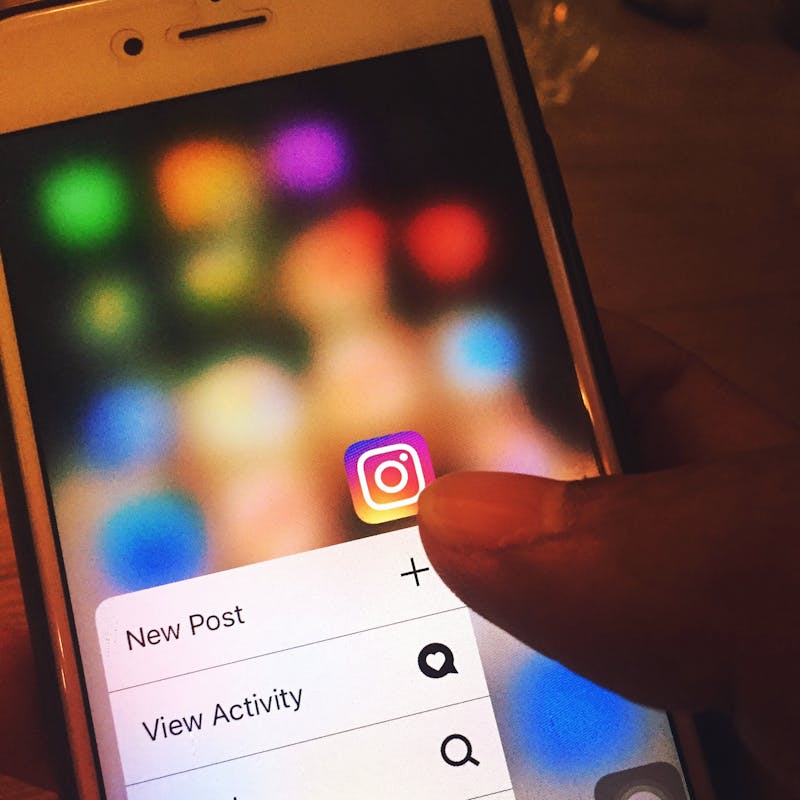
You can feel the inversion when a simple action requires a small ceremony. When you must create an account to read a document. When you must accept default notifications to proceed. When a “helpful” tutorial blocks the very thing you’re trying to do. The tool is no longer transparent; it is asserting itself.
The hidden cost of “power”
Modern design often confuses power with complexity. The tool that can do everything is treated as inherently superior to the tool that does one thing gracefully.
But power that demands constant attention is not power; it’s overhead. A tool that offers infinite options without offering clarity forces people to become part-time administrators of their own tasks. It turns ordinary work into project management.
Think of the difference between a kitchen knife that feels balanced in your hand and a multi-tool with fifteen attachments. The multi-tool may be impressive, but if every use requires selecting parts and locking mechanisms, the “power” becomes a speed bump. The best tools feel almost invisible when you’re in motion.
Design that serves people recognizes that capability is only valuable when it’s accessible. It doesn’t punish the beginner or overwhelm the expert. It offers depth without turning every surface into a control panel.
Attention is a finite resource, not a renewable one
Many tools compete for attention because attention can be monetized, measured, and reported. The result is a design culture that treats distraction as a feature.
A human-centered tool treats attention as sacred. It helps you stay with what you came to do. It avoids the little design tricks that tug at your impulse: badges, streaks, arbitrary urgency, constant prompts to share. It doesn’t mistake stimulation for satisfaction.
There’s a distinct feeling when a tool respects you. You close it and feel done, not restless. You don’t wonder what you missed. You don’t feel pulled back in.
Respectful tools reduce the “open loops” that keep people mentally tethered. They don’t manufacture worry. They don’t create a subtle fear that you’re falling behind unless you check in.
Designing for real life, not ideal users
A common design failure is assuming the user is calm, focused, and operating in perfect conditions. In reality, people use tools while tired, stressed, interrupted, and juggling responsibilities.
A tool that serves people anticipates reality.
It remembers where you left off. It tolerates mistakes. It makes undo easy and shame-free. It doesn’t treat a misclick as a catastrophe or a learning opportunity that requires a full-screen lesson. It behaves like a good assistant: it steadies you when you’re rushing.
Designing for real life also means acknowledging accessibility as a baseline, not an add-on. Text size, contrast, keyboard navigation, captions, readable language—these aren’t “extra.” They’re what it means to make a tool usable by the public.
The deepest form of respect is designing for someone who doesn’t have the energy to fight the interface.
Friction: when it helps, when it harms
The goal is not to remove all friction. Some friction is protective. A confirmation step before deleting something important is friction that serves the user’s future self. A pause before sending money is friction that prevents harm.
The problem is arbitrary friction—steps that exist because the tool wants something.
A tool may want more data, more permissions, more integrations, more subscriptions. It may want to cross-sell you a premium tier at the exact moment you’re trying to finish a task. It may funnel you into defaults that benefit the company more than the person.
Human-serving design is honest about trade-offs. If something costs money, say so without theatrics. If data is collected, explain it plainly. If a feature is limited, don’t obscure the boundary behind confusing UI.
Trust is a design outcome.
The quiet ethics of defaults
Defaults are where designers make the loudest decisions silently.
A default notification setting can shape a day. A default privacy choice can shape a life. A default sharing permission can shape a workplace culture.
People rarely change defaults because they assume defaults are recommended. They assume someone thought it through. In that moment, the designer is acting as a proxy for the user’s judgment.
Tools that serve people choose defaults that minimize regret. They prioritize safety, privacy, and clarity over extraction. They don’t hide meaningful choices behind a maze of settings pages.
This is not about being paternalistic. It’s about acknowledging power. If you know most people will accept what you set, then you are responsible for what you set.
Metrics that measure the wrong victory
If a team celebrates “time spent” as a win, the tool will become sticky. If a team celebrates “daily active users,” the tool will become needy. If a team celebrates “feature adoption,” the tool will become busy.
But the true success of many tools is the opposite: people get what they need and leave.
Consider the tools you trust most. A weather app that answers quickly. A map that gets you there. A note app that doesn’t lose your thoughts. Their best moments are almost forgettable, which is precisely the point.
To build tools that serve people, teams need better measures of value. Did the tool reduce confusion? Did it help someone finish? Did it prevent an error? Did it make the work feel lighter? These aren’t as easy to chart, but they’re closer to human reality.
Sometimes the most ethical metric is the one that asks, “Did we give people their time back?”
The dignity of a clear interface
Clarity is not minimalism for its own sake. It’s a promise that the tool won’t make you feel foolish.
A clear interface doesn’t mean hiding everything. It means revealing complexity in layers, at the moment it becomes relevant. It means using language people actually use, not internal terminology. It means designing error messages that explain what happened and what to do next without scolding.
There is a kind of dignity in a tool that assumes you are intelligent but busy.
You see it in small choices: buttons labeled with actions instead of vague nouns, menus organized by intent, settings grouped by meaning rather than by engineering history. You feel it when the tool seems to anticipate the question you were about to ask.
Interoperability as a form of respect
One way tools demand loyalty is by trapping information. Export options are hidden, formats are proprietary, integrations are limited unless you pay. The tool becomes a landlord: it lets you live in your own data, but moving out is painful.
A tool that serves people expects that it might not be the center of the universe. It supports common formats. It makes it easy to leave with your work intact. It doesn’t punish you for having a broader ecosystem.
This kind of design requires confidence. It says, “We believe you’ll stay because we’re useful, not because you’re stuck.”
Small scenes of what “serving people” looks like
A parent tries to schedule a doctor’s appointment between meetings. The portal loads quickly, shows the next available times, and doesn’t require a password reset ritual that turns five minutes into twenty. The task ends. The day continues.
A student finishes a paper at 1:00 a.m. The writing app doesn’t nag about templates or upsells. It quietly autosaves, restores the cursor where they left it, and exports without drama. The student goes to sleep.
A mechanic checks a manual on a phone with greasy fingers. The interface has large touch targets, readable text, and a search that understands common terms. The tool adapts to the world, not the other way around.
These are not “delight” moments in the usual sense. They are relief moments. They are competence moments. They are the kind of design that helps life move.
Building humility into the product
Humility is an unusual word in product design, but it belongs there.
A humble tool doesn’t assume it deserves constant engagement. It doesn’t assume its workflow is the user’s workflow. It doesn’t assume the user’s data is the company’s asset to exploit.
Humility shows up as restraint. It shows up as the willingness to say no to features that complicate the core job. It shows up as attention to “boring” reliability: fast load times, predictable behavior, stability over novelty.
It also shows up in listening—really listening—to the friction people report, especially when it conflicts with what the roadmap wants.
The future feels better when tools feel smaller
The direction of “smart” technology often points toward more: more automation, more prediction, more nudging, more integration. Sometimes that helps. Often it expands the tool’s footprint in your life until it becomes hard to tell where your intention ends and the system’s incentives begin.
Tools that serve people can still be ambitious. They can use advanced technology. But their ambition should be in service of shrinking the mental burden, not expanding the surface area of control.
A tool should make room for your attention to return to what matters: the work, the conversation, the craft, the rest.
In the end, the best-designed tools leave you with a simple feeling that’s increasingly rare: you were in charge the whole time. And when you put the tool down, your life is still yours.